EN
EN

designing-outer-booklet-covers-for-unbleached-rolling-paper-brands, designing-outer-booklet-covers-for-unbleached-rolling-paper-brands, /news
EN
2026/08/21
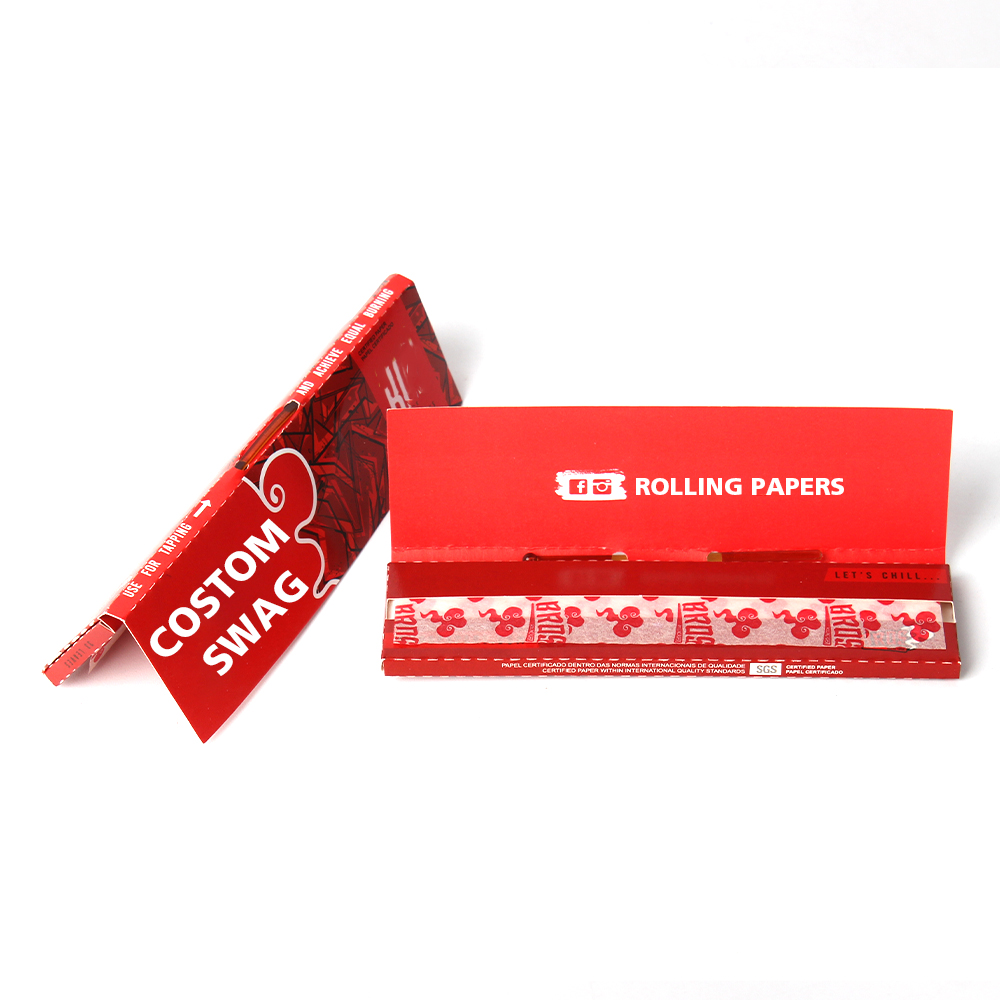
Creating an effective outer booklet cover for unbleached rolling papers requires a strategic blend of visual design, material authenticity, and brand storytelling. The outer booklet serves as the first point of contact between your brand and consumers, making its design critical to market positioning and sales performance. When crafting packaging for unbleached rolling papers, designers must balance aesthetic appeal with the natural, eco-conscious values that define the product category. This comprehensive guide explores the essential principles, design considerations, and practical techniques for developing compelling outer booklet covers that resonate with today's environmentally aware consumers.
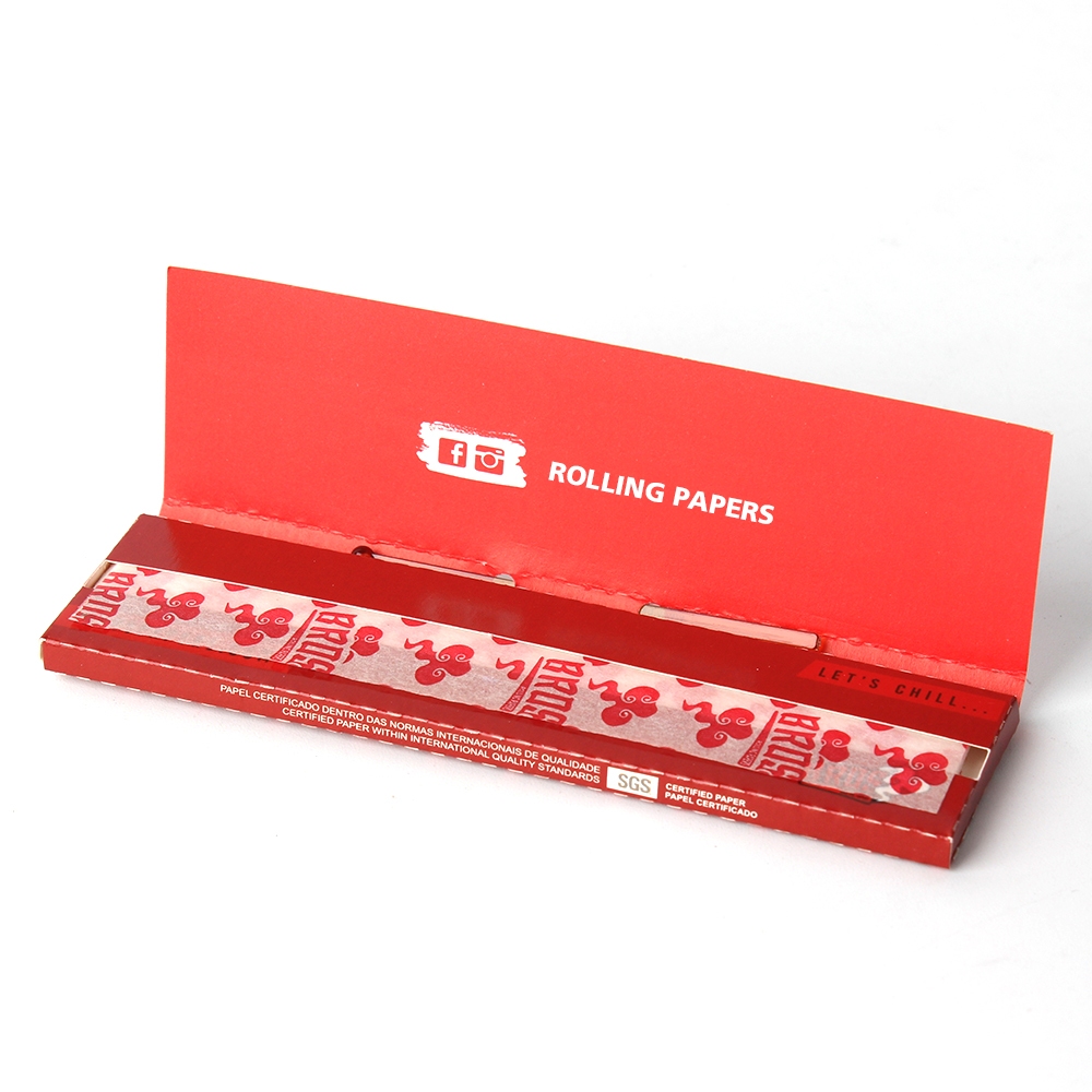
The design of outer booklet covers for branded natural paper products has evolved significantly as consumer preferences shift toward sustainability and transparency. Custom unbleached paper booklet covers communicate authenticity, quality, and environmental responsibility through their material choice and visual presentation. Understanding how to leverage these elements in your cover design directly influences brand perception, shelf visibility, and customer loyalty in a competitive market.
The foundation of any effective outer booklet cover begins with substrate selection. Custom unbleached paper offers natural color variations and textures that convey quality and eco-consciousness without requiring chemical processing. When selecting unbleached rolling papers packaging material, consider weight, finish, and durability to ensure the cover protects the inner booklet while maintaining visual appeal throughout its shelf life. Heavier grades provide perceived value and structural integrity, while lighter options reduce production costs and environmental impact.
Texture plays a crucial role in how consumers perceive branded natural paper products. A slightly textured unbleached surface creates tactile engagement and differentiates your brand from competitors using glossy finishes. The grain pattern of personalized booklet covers made from natural materials becomes part of the design narrative, reinforcing brand values around sustainability and authenticity. This material authenticity cannot be replicated through printing alone, making substrate choice foundational to design success.
Minimalist design approaches work exceptionally well for unbleached rolling papers covers, as excessive graphics compete with the material's inherent appeal. The neutral, warm tone of custom unbleached paper serves as a sophisticated canvas that requires thoughtful typographic hierarchy and strategic color accents. When designing personalized booklet covers, limiting your color palette to two or three complementary shades preserves the natural aesthetic while ensuring brand recognition and readability.
Typography becomes the primary design element when working with branded natural paper substrates. Select typefaces that convey craftsmanship and quality, avoiding overly digital or synthetic-looking fonts that contradict the natural positioning. Your brand name and key product information should occupy the visual center without overwhelming the cover's composition. This restraint in design elements actually strengthens brand recall, as consumers associate simplicity with premium quality and intentional branding.
Color selection for unbleached rolling papers booklet covers must respect and complement the substrate's existing warm, cream, or light tan hues. Rather than fighting the material's natural color range, effective designs enhance it through strategic color placement and complementary ink choices. Earthy tones such as sage green, burnt sienna, or charcoal gray create visual interest while maintaining the sustainable brand narrative that consumers expect from natural paper products. These colors print clearly on custom unbleached paper while reinforcing brand values.
Limited color palettes also offer production advantages by reducing ink layers and drying time, which can lower manufacturing costs for personalized booklet orders. Spot color printing often provides superior results compared to full-color process printing on natural substrates, creating sharper details and more vibrant finishes. Consider how your chosen colors will appear under various retail lighting conditions and on digital product images, as these touchpoints significantly influence consumer purchase decisions.
When incorporating visual elements into branded natural paper covers, prioritize imagery that reinforces authenticity and product quality. Line art, botanical illustrations, or geometric patterns work particularly well on unbleached substrates, as they remain visible and sophisticated without overwhelming the design. Photography can be effective but should feature natural lighting, organic textures, or authentic lifestyle contexts that align with the eco-conscious positioning of custom unbleached paper products.
Graphics should serve a functional purpose beyond decoration, such as visually communicating flavor profiles, product origin, or brand heritage. QR codes linking to brand stories, sustainability information, or product details add contemporary functionality to personalized booklet covers while respecting the natural design aesthetic. Keep graphic elements contained within defined areas of the cover, allowing adequate white space to breathe and draw attention to typography and material authenticity.
Successfully translating your design to production requires understanding how different printing techniques interact with unbleached rolling papers substrates. Offset printing typically produces superior results on natural papers, offering excellent ink adhesion and color consistency across large production runs. Digital printing offers flexibility for smaller production quantities and personalized booklet variations, though color accuracy may vary depending on substrate preparation and ink formulation. Working closely with your printing partner ensures that design specifications match substrate capabilities and production timelines.
Bleed specifications, trim lines, and fold placement become critical when designing outer booklet covers, as these elements directly impact finished product appearance and functionality. The natural texture of custom unbleached paper can affect ink density perception, making it essential to request test prints before full production runs. Color proofing on the actual substrate material prevents costly surprises and ensures that your branded natural paper design translates accurately from digital files to finished covers.
Cohesive brand identity across multiple unbleached rolling papers SKUs strengthens market positioning and consumer recognition. Establish clear design guidelines for typography, color usage, and graphic placement that maintain visual consistency while allowing flexibility for product differentiation. This structured approach to personalized booklet cover design creates professional presentation across your entire portfolio, whether customers encounter single products or complete product lines.
Template systems for booklet cover design streamline production workflows and reduce design iterations with stakeholders. Consistent placement of regulatory information, QR codes, and brand elements across all covers creates intuitive consumer navigation and reinforces professional brand perception. Document these standards to ensure consistency regardless of which team members handle design updates or new product launches.
Unbleached rolling papers substrates absorb ink slightly differently than bleached papers, which can result in slightly softer color appearance and more visible texture. This characteristic actually enhances the natural brand positioning for custom unbleached paper products. Modern printing techniques and inks are optimized for natural paper performance, producing excellent results when color profiles are properly calibrated. The slight variation in appearance reinforces authenticity and differentiates your branded natural paper from mass-market alternatives.
Minimalist typography, single-color accents, line art, and botanical illustrations consistently perform well on unbleached rolling papers covers. The substrate's natural beauty requires minimal graphic embellishment, so restraint in design creates professional, premium perception. Functional design elements such as product information hierarchies, subtle icons, or organized grid layouts enhance usability while maintaining visual sophistication. Focus on quality typography and strategic negative space rather than competing graphic elements.
Establish detailed design specifications including color values for both digital and print environments, specific typography guidelines, and precise element placement measurements. Work with a consistent printing partner familiar with natural paper substrates to maintain color accuracy and quality standards. Request reference samples from each production run and document any approved variations to ensure personalized booklet covers meet brand standards. Regular audits of finished products prevent drift in brand presentation and maintain consumer confidence in product quality.