EN
EN

how-to-keep-brand-colors-consistent-across-cone-and-packaging, how-to-keep-brand-colors-consistent-across-cone-and-packaging, /news
EN
2026/08/27
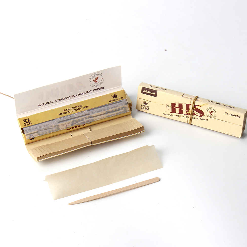
Maintaining visual consistency across all branded touchpoints is essential for building brand recognition and customer trust. When you work with pre rolled cones with custom logo designs, the challenge of keeping brand colors perfectly aligned between cone printing and custom packaging becomes critical to your market presence. Color inconsistency can undermine your brand identity and create a perception of poor quality, even when your product itself meets high standards.
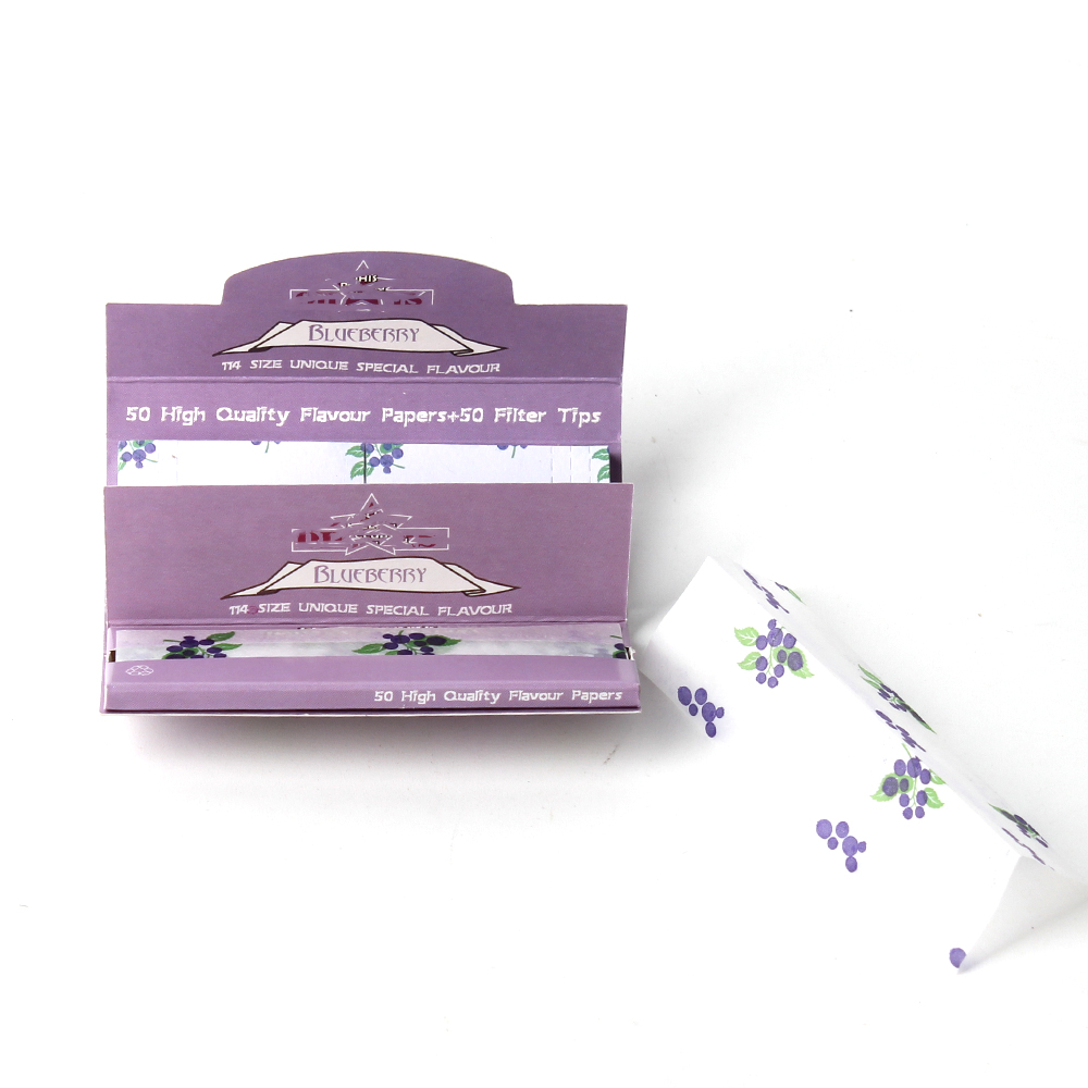
The process of managing brand colors across multiple production surfaces requires strategic planning, clear communication with manufacturers, and a systematic approach to quality control. Whether you are launching a new product line or refreshing an existing brand, understanding how to maintain color consistency in cone printing and custom packaging ensures that every customer interaction reinforces your brand message and creates a cohesive, professional impression that drives loyalty and repeat purchases.
The foundation of color consistency begins with defining your exact brand colors using industry-standard color models. Rather than relying on vague descriptors like 'forest green' or 'royal blue,' you must specify colors using Pantone Matching System (PMS), CMYK, RGB, or HEX codes depending on your production methods. For cone printing and custom packaging, having these specifications documented in a brand guideline document ensures that every supplier, vendor, and production team member works from the same reference point.
When you create your brand colors specification, consider how colors will appear under different lighting conditions and on different material surfaces. A color that looks perfect on glossy packaging may appear slightly different on the matte surface of a rolled cone. By testing your brand colors on both materials beforehand, you can adjust specifications to account for these material-related variations. This proactive approach prevents costly reprints and ensures that your cone printing and custom packaging maintain visual harmony despite surface differences.
Clear communication with your cone and packaging manufacturers is non-negotiable when managing brand colors across multiple production runs. Provide manufacturers with color specifications in multiple formats whenever possible. Include a Pantone reference, CMYK breakdown, and RGB values so that manufacturers can verify their equipment settings regardless of their internal production system. Many production errors stem not from equipment failure but from miscommunication about color expectations.
Request samples from manufacturers before committing to full production runs. When you receive samples for your cone printing and custom packaging, evaluate them under the same lighting conditions where your customers will view the final product. This real-world testing reveals color inconsistencies that may be invisible under artificial manufacturing lighting. Document your approval of samples in writing, and ask manufacturers to retain records of the exact color settings used so that future production runs can match the approved reference.
Cones and packaging materials present fundamentally different surfaces for color application. Pre rolled cones with custom logo designs typically involve printing on paper that may have a natural, slightly off-white base, whereas custom packaging often uses brighter white stocks or specialty materials with different finishes. These material differences mean that the same ink color will appear slightly different on each surface due to how light reflects and is absorbed.
To maintain brand colors across these different materials, work with manufacturers to create material-specific color adjustments while keeping the visual appearance consistent to the human eye. This concept is called 'visual matching' and is standard practice in professional printing. Rather than insisting that identical CMYK values be used on both cone printing and custom packaging, allow for slight formula adjustments that ensure the final color appearance matches your brand standard when viewed side by side. This flexibility, guided by clear communication and sample approval, delivers superior results than rigid adherence to single color specifications.
Different printing technologies affect how brand colors appear on your products. Digital printing, flexographic printing, and rotogravure printing each handle color differently, and cone printing often uses different methods than custom packaging production. Understanding which printing method your manufacturer uses for each component helps you set realistic color expectations. For instance, flexographic printing on cones may produce slightly more vibrant colors than digital printing on packaging due to how the ink is applied and cured.
Request that manufacturers maintain consistent ink coverage percentages across both cone printing and custom packaging runs. Ink coverage directly impacts color intensity and vibrancy. If one production facility applies ink at 85% coverage while another applies it at 90%, the color difference will be visible to customers. Establish written standards for ink coverage and include this specification in your contracts with manufacturers to ensure accountability and consistency across all your branded materials.
Establish a formal color verification process that occurs at multiple stages of production. Before production begins, compare manufacturer samples against a master color reference under standardized lighting. During production, implement regular in-line color checks to catch variations early. After production, conduct final quality inspections comparing finished pre rolled cones with custom logo designs and packaging samples side by side under consistent lighting conditions.
Invest in a spectrophotometer, an instrument that measures color objectively using light wavelengths rather than subjective human observation. This device can detect color variations as small as 0.5 Delta E units, far below human perception thresholds for most colors. By taking spectrophotometer readings at the start, middle, and end of production runs, you create an objective record of color consistency. This data-driven approach to brand colors verification eliminates disagreements and provides manufacturers with clear evidence when adjustments are needed.
Document your color approval process thoroughly. Keep a file containing approved samples of cone printing and custom packaging together with their corresponding color specifications. This master file becomes the reference standard for all future production runs and vendor comparisons. When a new manufacturer or production facility begins working on your branded materials, provide them with this documented standard so they understand your brand colors expectations from the outset.
Establish clear acceptance criteria for color variations. Define acceptable Delta E tolerances for different color families. For example, you might accept a Delta E variation of ±1.0 for neutrals but require ±0.5 for brand primary colors. By setting these thresholds in advance, you create objective standards that manufacturers can work toward rather than leaving them to guess at your expectations. This transparency reduces back-and-forth revisions and accelerates production timelines while maintaining the brand colors consistency you require across all materials.
Different materials absorb and reflect light differently, and different printing methods apply ink with varying coverage levels and curing processes. Paper cones often have a natural off-white base that interacts with ink differently than bright white packaging stock. To maintain brand colors consistency, work with manufacturers to create visual matches rather than identical ink formulas. Request samples under real-world lighting conditions before approving production runs, and use spectrophotometer measurements to verify color accuracy objectively.
Provide color specifications in multiple formats including Pantone numbers, CMYK percentages, and RGB values. Include physical approved samples of cone printing and custom packaging alongside written specifications. Document all color requirements in a formal brand guideline document that becomes part of your manufacturing contracts. Request that manufacturers retain records of their color settings for each production run so future batches can reference and match previous work for consistency.
Conduct color checks at three critical points: before production begins comparing samples to your master reference, during production at regular intervals to catch variations early, and after production when conducting final quality inspections. Use both visual inspection under standardized lighting and objective spectrophotometer measurements to document brand colors accuracy. For high-volume orders of pre rolled cones with custom logo designs and packaging, perform checks at least every 500 units to ensure that color consistency is maintained throughout the entire production run.