EN
EN
why-filter-tip-branding-should-match-the-cone-body-design, why-filter-tip-branding-should-match-the-cone-body-design, /news
EN
2026/08/20
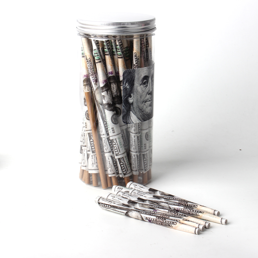
Pre-roll cones with filter tips represent a significant investment in your brand identity and product quality. When customers reach for your product, the visual experience begins the moment they see the packaging and handle the cone itself. The filter tip logo and overall cone branding must work in harmony to create a cohesive, professional appearance that reflects your brand values. This alignment between filter tip design elements and the cone body design is not merely aesthetic—it directly influences customer perception, brand loyalty, and market positioning.
For businesses in the rolling paper and smoking accessories space, establishing strong design consistency across all product elements is foundational to private label success. Whether you are a distributor, retailer, or manufacturer offering custom solutions, your Pre-Roll Cones with Filter Tips must communicate a unified visual message. Inconsistencies between filter tip branding and cone body design can undermine product credibility and confuse your target market about what your brand stands for.
Design consistency is a cornerstone of professional branding in the smoking accessories market. When your filter tip logo and cone branding elements follow the same visual language—color palette, typography, line weight, and iconography—customers develop stronger brand recognition. This consistency builds trust because it signals that your business has invested in quality control and professional presentation. In the private label space, where differentiation is key, maintaining design consistency across every touchpoint, including the filter tip itself, separates established brands from casual competitors.
The cone body design serves as the primary canvas for your brand expression, but the filter tip logo often receives overlooked attention. Many manufacturers and distributors focus on the cone's main surface while treating the filter tip as secondary. This mistake creates a fractured visual experience. When consumers examine your product, their eyes move across the entire cone, including the tip. A mismatched filter tip logo or inconsistent cone branding elements can break the visual narrative you have worked to establish. Alignment ensures that every millimeter of the product reinforces your brand identity.
Research in consumer behavior demonstrates that visual consistency directly influences purchase intent and perceived value. When filter tip design aligns seamlessly with cone branding, customers subconsciously perceive higher quality and greater attention to detail. This psychological connection translates into higher willingness to pay premium prices and increased repeat purchases. For private label operators, this effect becomes even more pronounced because private labels must overcome the inherent trust advantage that established national brands possess. Consistent design messaging becomes your competitive weapon.
The filter tip logo should not feel like an afterthought or a separate design element tacked onto the cone body. Instead, it must integrate naturally into the overall cone branding strategy. This integration might mean using the same color scheme, adopting complementary typography, or incorporating your brand's signature visual elements into the tip design. When executed properly, the filter tip becomes an extension of your cone branding narrative rather than a disconnected detail.
Establishing a unified color palette is the first step in ensuring design consistency between your filter tip logo and cone branding elements. Your primary brand colors should dominate both surfaces, with secondary accent colors used strategically to guide the viewer's eye. If your cone branding features a bold primary color with metallic accents, your filter tip logo should echo these same colors rather than introducing entirely new ones. This chromatic harmony makes the product instantly recognizable and reinforces brand recall in retail environments and digital platforms.
Within this unified palette, establish clear visual hierarchy. Your filter tip logo might use a simplified or miniaturized version of your full cone branding design, ensuring that the scaling and proportions feel intentional and balanced. Some private label operators use the filter tip to feature a single logo mark or abbreviated brand name, allowing the full visual story to unfold on the cone body itself. This approach maintains design consistency while respecting the physical constraints of the filter tip surface. The key is that the relationship between the two elements should feel deliberate and professionally executed.
Typography should connect the filter tip logo with the cone branding. Use the same typeface, font size, and alignment where text appears to create a consistent and professional brand identity.
The same principle applies to other visual elements. If the cone uses geometric patterns, botanical illustrations, or a minimalist style, the filter tip should follow a similar visual direction. Consistent design helps private label products appear more cohesive and premium.
The small dimensions of a filter tip require logos to remain clear and recognizable at production scale. Simplify complex cone branding elements when necessary and test the design at its actual printed size before manufacturing.
The filter tip should also complement the cone body rather than compete with it. Leave sufficient visual space around the filter tip and avoid placing heavy branding elements directly above it. This creates a more cohesive and balanced product design.
Private label pre-roll cones operate in an increasingly competitive landscape where quality products alone are insufficient for market success. Your filter tip logo and cone branding must work together to communicate why your private label deserves consideration. This unified design approach signals to distributors and end consumers that you understand the smoking accessories market and respect your customer base enough to invest in professional presentation. Inconsistent or mismatched design elements suggest either carelessness or insufficient investment in your brand, both of which undermine private label positioning.
Successful private label operators recognize that design consistency is a form of quality assurance communication. When every element—from cone branding to filter tip logo—reflects careful attention and professional execution, customers extrapolate that same quality consciousness to the product's performance and material standards. This halo effect means that excellent design consistency can actually contribute to customer satisfaction and reduce return rates or complaints. Your filter tip logo becomes evidence that your private label brand is worth trusting.
Achieving design consistency between filter tip and cone body requires close coordination with your manufacturing partner. Provide detailed specification documents that clearly communicate the relationship between filter tip logo placement, size, color application, and cone branding elements. High-quality manufacturers will proactively identify potential alignment issues and suggest solutions. Specify production tolerances for color matching, ensuring that ink formulations and application methods produce consistent results across both surfaces. Request production samples that include cone branding and filter tip logo elements together, allowing you to evaluate the combined visual effect before full production runs commence.
Document your design specifications thoroughly so that future production runs maintain consistency. This becomes especially important if you scale your private label operation or change manufacturing partners. Comprehensive brand guidelines that address cone branding, filter tip logo requirements, color specifications, and spatial relationships serve as institutional memory and quality control tools. Photography of approved production samples further helps manufacturers understand your expectations and ensures that design consistency remains intact across multiple production cycles.
Filter tip logo design influences how consumers perceive overall product quality. When the logo follows the same visual standards and design language as the cone branding, it creates a more professional and cohesive appearance.
For private label products, consistent filter tip and cone branding can strengthen brand identity, increase perceived value, and support premium positioning.
Established brands have the luxury of brand recognition that somewhat buffers inconsistencies in design execution. Private label products lack this recognition advantage, making design consistency even more critical to success. Private label operators must achieve excellence across every detail because they lack the trust equity of established names. Filter tip logo alignment with cone branding is not optional for private label success; it is a fundamental component of market differentiation. Where established brands might recover from minor design inconsistencies, private label producers must maintain perfect visual alignment to establish credibility and justify their market position.
Provide detailed design specifications covering cone and filter tip colors, Pantone references or digital color codes, actual-size logo renderings, placement tolerances, and alignment requirements. Request production samples combining the full cone branding with the filter tip logo to verify visual consistency before mass production.
Define QC criteria for color matching, print clarity, and design proportions. Clear specifications help maintain consistency across production runs and give your manufacturing partner precise requirements.